You downloaded Alight Motion. You opened it. And now you’re staring at a blank screen thinking… okay, what do I actually tap first.
Been there.
Alight Motion is one of those apps that looks simple for about 6 seconds, then you notice keyframes, graphs, blending modes, masks, color effects, and suddenly it feels like you accidentally installed a tiny After Effects on your phone.
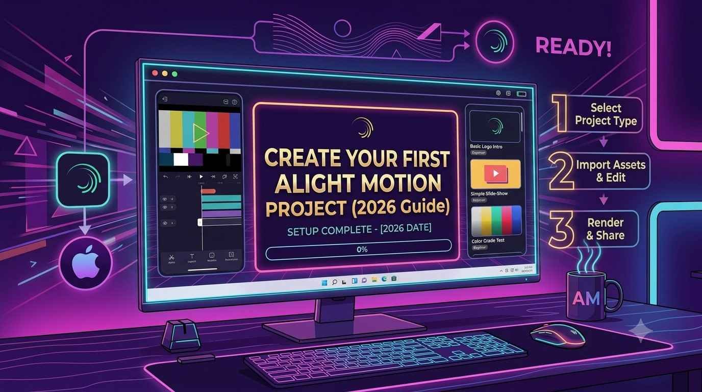
This guide is for making your first real project. Not a random button mash. A clean, exportable edit with motion, text, and effects. The kind you can post.
We’ll build a simple but good looking intro edit. Background, moving shape, text reveal, a bit of glow, and a clean export.
What we’re making (so you know where this is going)
A 6 second vertical video (1080×1920, 30fps) with:
- A blurred background image (or video)
- A shape that slides in with easing
- Text that pops in with a mask reveal
- A subtle glow and color tweak
- Music sync if you want it
Nothing too crazy. But it teaches the core of Alight Motion: layers, keyframes, easing, effects, and exporting.
Before you start: install packs, set expectations
If you’re brand new, do this first:
- Update Alight Motion to the latest version (2026 builds have small UI differences and bug fixes).
- Log in so your projects don’t vanish if you clear storage.
- Optional but helpful: download fonts you like (Google Fonts, Dafont, etc). Keep them organized.
Also, quick reality check. Alight Motion can run on mid phones, but heavy effects will lag. That’s normal. You can still edit fine by previewing at lower quality and keeping your project short.
Step 1: Create a new project (the right way)
Open Alight Motion.
Tap the plus button to create a new project.
Use these settings:
- Aspect Ratio: 9:16 (vertical)
- Resolution: 1080p (1080 x 1920)
- Frame Rate: 30 fps (use 60 fps only if your clips are shot in 60 and you want super smooth motion)
- Background Color: Black (we will cover it anyway)
Name it something like: First Project 2026.
Tap Create Project.
Quick note on FPS
30fps is easier for beginners. Less strain. Less glitchy preview. And most social apps will compress it anyway.
Step 2: Add a background (image or video)
Tap + Add Layer.
Choose one:
- Image (simple, clean)
- Video (more dynamic)
Pick something that matches your vibe. If you don’t have anything, even a random photo works for practice.
Now you should see your media as the bottom layer in the timeline.
Fit it properly
Tap the background layer to select it.
Use Transform to scale and position so it fills the screen. No black edges.
If it’s a photo and looks too sharp, that’s fine. We’re about to style it.
Step 3: Make it look cinematic in 20 seconds (blur + dim)
Select the background layer, then tap Effects.
Blur
Add a Gaussian blur (if available). Start with an amount between 10 and 25.
Color & Light
Add a Color & Light effect (or similar). Lower the brightness slightly and add a little contrast.
The goal is simple. The background should be a vibe, not the main subject. You want your text and shapes to stand out.
If your background is already dark, skip the dim and just blur a touch.

Step 4: Add a shape layer (this is where motion starts)
Tap + Add Layer again, choose Shape, and pick Rectangle (or Square, doesn’t matter). Make it a tall vertical bar or a wide block — something simple.
Now style it:
- Tap Fill Color
- Choose a bright color — white works, or neon blue, or pink
- Optional: reduce opacity to around 85 percent for a softer look
Position the shape off screen to the left so it can slide in.
Animate it with keyframes
Keyframes are the core skill here. They tell the app: “at this time, the layer is here.” Follow these steps in order.
First, set the starting position:
- Move the playhead to 0:00
- Select the shape layer
- Tap Transform
- Next to Position, tap the little diamond to add a keyframe
- Keep the shape off screen to the left
Then, set the ending position:
- Move the playhead to between 0:18 and 0:25 (roughly 0.6 to 0.8 seconds in, depending on your timeline)
- Drag the shape into the center, or wherever you want it to stop
- The second keyframe is created automatically
Press play. Your shape slides in. Congrats — that’s a real animation.
If you want to take things up a notch and add some interesting effects like bubble distortion or even masking and rotoscoping for more complex animations, consider exploring those techniques as well!
Step 5: Make it smooth (easing, the thing that makes it not look cheap)
Right now it probably moves like a robot. Linear motion.
Tap the first or second keyframe (or open keyframe list) and find Easing.
Choose something like:
- Ease Out for the first move
- Or Ease In Out if you want it to start slow and end slow
If Alight Motion shows curves or a graph editor, don’t overthink it. Just pick an ease preset.
Play it again. You should feel the difference immediately.
This one step is what separates “beginner edit” from “oh that’s clean”.

Step 6: Add your text (and make it reveal nicely)
Tap + Add Layer.
Choose Text.
Type something simple:
- Your name
- A title
- “NEW EDIT”
- “2026”
Pick a font that’s readable. Don’t go fancy yet.
Place the text near the center, maybe slightly above the shape.
Animate text pop in (basic way)
You can keyframe text scale:
- Playhead at 0:10
- Select text layer
- Transform > Scale
- Add keyframe at scale 0 percent or like 10 percent (tiny)
- Move to 0:22
- Set scale to 100 percent
Add easing. Use Ease Out so it pops smoothly.
That’s fine. But we can do a better reveal.
Step 7: Text reveal with a mask (this is the fun part)
Masking sounds scary. It’s not.
We want the text to appear like it’s being revealed by the sliding rectangle.
Option A: Use the rectangle as a mask (common approach)
If your shape layer is the rectangle sliding in, you can use it to reveal the text.
General idea:
- Put the text layer above the rectangle layer (or vice versa depending on mask type)
- Apply a Mask to the text
- Set mask reference to the rectangle
In Alight Motion the exact menu names can vary by version, but look for:
- Masking
- Mask
- Track Matte
- Alpha Mask
You want something like: Text uses Shape as Alpha Mask.
When done right, the text will only show where the rectangle overlaps it. So as the rectangle slides in, the text reveals.
Option B: Simple mask inside the text layer
If Option A is confusing on your version, do this instead:
- Duplicate the rectangle layer
- Place it above the text
- Use it as a mask for the text
- Animate that mask rectangle to slide across the text
Same result. Slightly more steps.
If you get stuck, don’t panic. Masking is the most “depends on UI” part of this guide. The concept is the win.
Step 8: Add a glow (but keep it tasteful)
Select the text or the shape (or both).
Tap Effects and add a Glow effect. Increase the radius a little, keep the intensity moderate, and pick a glow color that matches your shape.
If your edit starts looking like a 2017 Fortnite montage, lower glow intensity. Seriously.
A subtle glow reads as premium. A heavy glow reads as beginner.
Step 9: Add a little camera motion (tiny zoom, instant upgrade)
This is optional but it makes everything feel more alive.
Tap + Add Layer and choose Group (or a precompose-style option) if available.
If grouping is available
- Put your background, shape, and text inside a group.
- Animate the group scale from 100 to 103 over the whole 6 seconds.
If grouping is not available
- Animate only the background: scale 100 at 0:00, scale 105 at 6:00.
Ease it in and out. It’s such a small thing, but it adds “camera drift” like motion graphics.
Step 10: Sync to music (optional, but this is how edits feel intentional)
Tap + Add Layer and choose Audio. Import a track — a beat, a soft ambient track, or anything that fits.
Zoom into your timeline and listen for the beat drop or a clear hit. Move your keyframes so the rectangle lands exactly on a beat, and the text pop hits right after.
That’s it. Sync is mostly timing. For cleaner sync, keep it simple: one big motion on the beat, one small motion right after. Don’t animate 30 things for your first project.

Step 11: Clean up the timeline (so you don’t hate yourself later)
A few quick habits:
- Rename layers (Background, Shape, Text, Audio)
- Trim layers to match what’s visible
- Keep your project short (6 to 10 seconds while learning)
- If you duplicate layers, label them like Shape Mask, Shape Main
You’ll thank yourself.
Step 12: Export settings (the ones that usually work)
Tap the Export icon.
Use these settings for most social platforms:
- Format: MP4
- Resolution: 1080p
- FPS: same as project (30)
- Bitrate: high if you can, but not insane
- Audio: on, AAC if you see the option
Export.
If it fails, it’s usually one of these:
- Too many heavy effects (glow + blur + sharpen + motion blur all stacked)
- Not enough storage
- Phone overheating
- Project resolution too high (try 720p for a test export)
Quick troubleshooting if export looks blurry
- Don’t upscale beyond your source quality
- Avoid exporting at low bitrate
- Make sure you’re not previewing and assuming that preview quality is export quality, they’re different
A simple “first project” checklist (copy this)
Before you post it, check:
- Background blurred and dimmed enough
- Shape motion is eased
- Text is readable on mobile
- Effects are subtle
- Timing feels intentional
- Export is 1080×1920, not square, not sideways
Common beginner mistakes (so you skip the pain)
1. Too many effects stacked
Glow on glow on blur on shake on chromatic aberration. It adds up fast. Your phone lags. Export fails. And it looks messy anyway.
Pick 1 or 2 effects that support the idea.
2. No easing
Linear animation looks like a PowerPoint slide.
Even basic Ease Out fixes it.
3. Tiny text
Your edit might look fine zoomed in while editing. Then you post it and on a real phone it’s unreadable.
If it’s a title, make it big. If it’s a subtitle, keep it simple.
4. Not trimming layers
If your text only appears for 2 seconds, trim the layer. It keeps the timeline clean and prevents accidental overlap issues.
A mini project idea to try next (same skills, different vibe)
Once you finish the intro edit, try this:
- Background: short video clip (city, sky, anything)
- Text: one word only (like “MIDNIGHT”)
- Shape: thin line that wipes across
- Effects: blur + slight glow
- Motion: slow zoom in background
Same exact skills. Just a different feel.
Wrap up (you did the hard part)
Your first Alight Motion project isn’t supposed to be perfect. It’s supposed to exist.
If you got a shape to move with keyframes, eased it, added text, and exported a clean 1080×1920 video. That’s real progress. You’re not stuck on the home screen anymore.
And honestly, once you understand layers plus keyframes plus easing, everything else in Alight Motion becomes “just another tool”. Masks. graphs. presets. All of it.
If you want, tell me what kind of edit you’re trying to make next (anime, lyric video, logo intro, reels transition, whatever) and what phone you’re on. I’ll suggest a simple project setup and effects that won’t crash your exports.
FAQs (Frequently Asked Questions)
What is Alight Motion and how complex is it for beginners?
Alight Motion is a powerful mobile video editing app that initially looks simple but includes advanced features like keyframes, graphs, blending modes, masks, and color effects, making it feel like a mini After Effects on your phone. This guide helps beginners create their first real project without random button mashing.
How do I start my first project in Alight Motion with the correct settings?
To start your first project, open Alight Motion and tap the plus button to create a new project. Use these settings: Aspect Ratio 9:16 (vertical), Resolution 1080×1920 (1080p), Frame Rate 30fps (recommended for beginners), Background Color Black. Name your project appropriately and tap Create Project.
How can I add and style a cinematic background in my Alight Motion project?
Add a background by tapping + Add Layer and choosing either Image or Video. Fit it properly using Transform to fill the screen without black edges. Then apply effects: add Gaussian Blur with an amount between 10-25 to soften it, and add Color & Light effect to slightly lower brightness and increase contrast, making your background subtle so text and shapes stand out.
What are keyframes in Alight Motion and how do I animate a shape sliding in?
Keyframes mark specific points in time for layer properties like position. To animate a shape sliding in: add a Shape layer positioned off-screen left; at 0:00 timeline, set a keyframe for its starting position; then move the playhead to around 0.6-0.8 seconds, drag the shape into view (the second keyframe sets automatically). Playing this will animate the shape sliding smoothly into place.
What should I do before starting with Alight Motion to ensure smooth editing?
Before you start, update Alight Motion to the latest version for UI improvements and bug fixes. Log in to prevent project loss if storage is cleared. Optionally download fonts you like from sources like Google Fonts or Dafont and keep them organized. Also consider device capability since heavy effects may lag on mid-tier phones; previewing at lower quality helps.
Why is 30fps recommended for beginner projects in Alight Motion?
30 frames per second (fps) is easier for beginners because it puts less strain on your device, results in smoother previews with fewer glitches, and aligns well with most social media platforms which compress videos anyway. Use 60fps only if your clips were shot at that frame rate and you want super smooth motion.